12-14 July 2023
National Exhibition and Convention Center · Shanghai · China

5 Emerging Trends in E-commerce Package Design

The rise in e-commerce in 2020 forced brands to rethink their package design to connect with consumers outside the retail environment. Here are five design trends that resulted and advice on how to select the style that’s best for your brand.

Author-Shayne Tilley

May 12th, 2021

While e-commerce was already well established before the pandemic, 2020 certainly prompted widescale changes in online shopping behavior that appear permanent. As retailers fought to continue operating after closing their physical stores, we also saw unprecedented e-commerce adoption as both business owners and consumers worked to keep up with this new retail reality.

This was brave new territory for many small businesses that, among many other things, now had to consider how they could continue making meaningful connections with their customers in a socially distanced world. Suddenly, the box in the mail became the only chance for brands to have a physical interaction with buyers—and this has had an interesting effect on packaging design!


When looking at the design trends shaping e-commerce packaging this year, there is a clear theme. Thanks to the astronomical rise of online shopping, we’ve seen an increasing number of brands turning away from plain or stock packaging. Instead, boxes are now looking like works of art in their own right as brands aim to deliver a little piece of their personality straight to customers’ doorsteps.

Let’s take a look at five of these artful trends shaping packaging right now.

1. Solid, all-over color

Superfood smoothie maker TUSOL Wellness uses a range of shades directly representing the hero ingredient of each of its individual smoothie sachets.


Probably one of the most simple but effective trends in e-commerce packaging design right now, this style sees products packaged in single, solid colors. 

Unlike other trends, which make use of intricate illustrations or bold typefaces, it’s the use of bold, bright, and often unconventional shade choices that draw the buyer in. The correct color choices can both create a specific aesthetic for your products as well as give customers subtle clues about the ingredients.

For example, Los Angeles-based superfood smoothie maker TUSOL Wellness uses a range of shades directly representing the hero ingredient of each of its individual smoothie sachets, making each flavor easily recognizable. The color choices are also paired with a shiny, metallic material, giving each sachet a luxurious look and feel.

While this trend is a lot more understated, it is an incredibly powerful way to ensure products stand out against the competition.

2. Hyper-simplistic geometry

The grid-like design on California’s Sincere Cider uses various elements and colors inspired by apples to evoke the crisp, clean flavors to be found within.


Another design trend shaping (literally) the packaging world right now is the use of simple yet striking geometric concepts. Here, designs incorporate straight and neat lines and tight angles paired with distinctive colors to make an unforgettable impression on customers. 

While geometric patterns may look plain at first glance, the superpower of this design style is in its abstract simplicity. Instead of straight up showing or telling customers with illustrations or imagery, these clever geometric elements give them hints of what to expect when they open things up. For example, the grid-like design on California’s Sincere Cider uses various elements and colors inspired by apples to evoke the crisp, clean flavors to be found within.

3. Product names front and center


Supplement maker Crystal Star pairs strong typefaces with clean, bright colors for the product names on its bottle labels.


It’s time to let your product names do the talking with the use of striking typography that makes each word feel like a piece of artwork in itself. Rather than placing a logo, brand name, or illustration center stage, the names of the products themselves are now the star of the show. Any additional design elements are simply used to make the name stand out. 

As this style leaves no doubt as to what the product is called or does, it is the perfect trend for product-focused businesses that are looking to increase brand awareness. Through the use of creative and eye-catching lettering, this design style has the unique ability to give a product a distinctive personality all its own. 

Unlike most traditional supplement companies, Minnesota’s Crystal Star has leveraged this trend on its simple yet stylish packaging to appeal to customers seeking alternative wellness products. Pairing strong typefaces with clean, bright colors for the product names on its bottle labels, these products can entice older and younger generations alike.

4. Organically shaped color blocking

Clean skincare brand ORPHEUS uses soft organic shapes and colors on its packaging to create the image of a stunning ethereal landscape.


Undoubtedly one of the most popular design trends right now, this style beautifully merges the shift towards increasingly environmentally conscious consumer sentiment and the overarching art-inspired design trend seen right now in e-commerce. 

Color blocking as a concept isn’t exactly new. But doing so with softer and more natural colors, shapes and textures? That’s very 2021. Rather than clear, straight, lined boxes of color, these are collages of unbalanced, unevenly weighted shapes overlaid with freckles, squiggles, and spirals.

Whether abstract or portraying scenes found in nature, these designs are a welcome breath of fresh air for so many of us who spent the majority of the past 12 months cooped up inside. A great example can be found with clean skincare brand ORPHEUS, which uses soft organic shapes and colors on its packaging to create the image of a stunning ethereal landscape that is a nod to the Resurrection Flower found in its products.

5. Picture-perfect symmetry

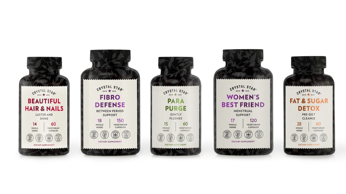
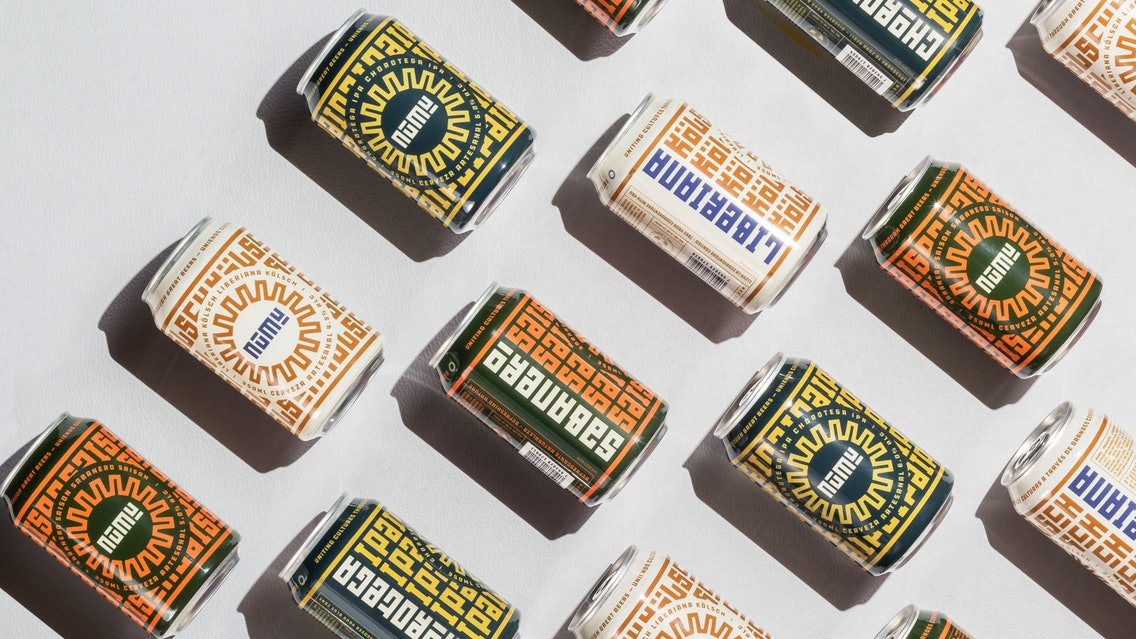
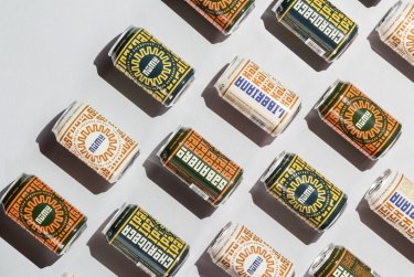
Costa Rica’s Numu Brewing uses bold, almost hypnotic symmetrical patterns on its beer packaging.It’s not uncommon for the top design trends each year to appear contradictory. In fact, it’s almost expected! Not everyone likes the same pizza toppings, so to speak. While some designers and brands are experimenting with imperfect shapes and unusual patterns, we’re also seeing packaging that swings in the complete opposite direction by playing with order and balance.

Whether incredibly complex and tight illustrations or looser, more disconnected patterns that leverage negative space, the visually satisfying nature of symmetry elicits a sense of calm, order, and grounding—starkly contrasting the chaos of the last year. A perfect example can be seen on the bold and almost hypnotic symmetrical patterns on the beer cans of Costa Rica’s Numu Brewing.

Now it’s time to get started!

Whether you’re an e-commerce business looking to level up your packaging game this year or a fresh, new brand just starting out, tapping into design trends can be an easy yet effective way to ensure your brand stands out and leaves a lasting impression on customers. But when the design trends all look so incredible, deciding which style is right for your brand can be a bit daunting. In this instance, it can be helpful to ask yourself a series of questions before you start the product packaging design process.

·      What is the product? Of course, you need to know how big it is, what shape it is, and what it does to inform the logistical side of things. But by breaking it down even further, you can draw out inspiration for the type of design you’re going to use. What ingredients is it made of? Does it have a particular scent or texture? As we saw with the above trends, often the design—whether it’s a pattern, illustration, or clever use of colors—is so much more than simply an embellishment.

·      Who’s buying the product? Your packaging should appeal to your ideal customer, so it’s important that you know who that customer is before designing your packaging. So next you need to ask yourself, who’s your target audience? What do they value and need? Are they old or young? Are they environmentally conscious? Are they on a budget, or do they have a higher disposable income? By homing in on your ideal customer and what’s important to them, you can narrow down your design choices to something that’s truly going to catch their eye.

·      Who are you as a brand? Finally, ensure you know who you are as a brand. It’s all very well creating stunning packaging, but if it doesn’t mirror your values, purpose, and personality, it’s not going to create a seamless brand experience. This doesn’t mean you can’t experiment with quirky design, but it should fit within the parameters of your overarching brand narrative. Are you playful or serious? Are you luxurious or cost-effective? Energetic or stoic? And most importantly, what do you stand for? 

The answers to the above questions will help you form a blueprint that will guide every facet of your packaging design—from fronts, logos, copy, and colors right through to the materials and different layers you use.

With many consumers realizing that shopping online is beneficial for their daily lives, there’s no doubt that e-commerce looks set to be the norm for many of us. And with the effects this has already had on e-commerce packaging design, it’s likely we can expect to see plenty of beautifully designed packages arriving in our homes for the foreseeable future.  PW

Shayne Tilley is Head of Marketing for 99designs, the global creative platform by Vistaprint.


Source Link : https://www.packworld.com/design/package-design/article/21404000/ecommerce-packaging-design-trends#next-slide